
Accessible Websites for Health and Patient-Support Organizations

The 2 a.m. visitor
It’s late, and someone is on their phone trying to find a support group for a parent who was just diagnosed. They’re tired. They’ve already closed two sites that buried the answer three clicks deep. Whether they find help in the next two minutes depends almost entirely on how the next website is built.
That visitor is the one health and patient-support organizations actually serve. Not the calm browser with time to spare, but the person arriving on a hard day, often on a small screen, sometimes navigating with assistive technology or limited energy. For this audience, accessibility and clarity aren’t polish. They’re the difference between someone finding help and someone giving up.
We’ve spent 29 years building for mission-driven organizations, and patient-support groups are some of the work we care about most. What follows is what we’ve learned about building for them, with examples from organizations we’ve worked with along the way.
Why health and patient-support websites are harder than they look
From the outside, a support organization’s website looks like any other nonprofit site. It isn’t. Building accessible websites for health organizations means designing around three pressures that stack up at once, pressures most sites never face together.
The visitor is often in distress. People arrive mid-crisis, newly diagnosed, or worn down from caregiving. They don’t have patience for clever navigation or a hunt for the obvious answer. Every extra click is a chance to lose someone who needed help.
The audiences are genuinely different. A single homepage usually has to serve patients, caregivers, donors, and volunteers at the same time, and each one wants something the others don’t. The temptation is to add more content for everyone. The result is a site that serves no one well. The fix is structure, not volume: focused content paths that let each person find their way fast.
The stakes are higher than a bounce. On most sites, a confused visitor costs you a click. Here, it can cost someone the help they were looking for, at the exact moment they could least afford a dead end.
Accessibility isn’t the constraint people think it is
The most common misconception we hear is that accessibility is a tax: that an accessible site has to be plainer, or that you can have accessibility or a modern brand or deep system integration, but not all three. None of that is true, and it matters because this audience includes more people with disabilities, illness, and limited energy than almost any other.
A few things worth being clear about.
WCAG 2.1 AA is the working standard. It’s the level U.S. accessibility law generally points to, and it should be the baseline for any site in this space. Some organizations go further: Look Good Feel Better’s site was built to the newer WCAG 2.2 AA, a step beyond what the law requires.
Accessibility coexists with complexity. The belief that you must choose between an accessible site and a deeply integrated one is the myth we run into most. Accessibility and integration aren’t a tradeoff. They’re a planning problem you solve up front.
Accessibility is ongoing, not a launch-day checkbox. A site drifts the moment staff start adding content, so conformance has to be something the team can maintain, not a one-time audit. That’s why we monitor sites for ongoing conformance after launch.
A website you can actually run is part of the mission
The website problems organizations call us about are usually the same problem surfacing two years late: the site was built for launch day, not for the team that has to live with it. Staff turn over, content grows, an unmanageable backend slowly falls out of date, and accessibility quietly erodes along with it.
For mission-driven organizations running lean, this is existential, not cosmetic. The groups that stay current are the ones whose staff can update the site themselves, without a developer on call and without breaking accessibility every time they add a page.
Two things make the difference: build on a platform your staff can use (we use WordPress with block-based editing), and insist on real training as part of the project, not an afterthought.

The work behind the lessons
Each project below shaped the thinking above. Here’s the short version of each, with a link to the full story.
Look Good Feel Better
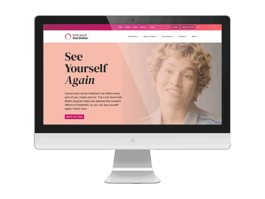
Look Good Feel Better helps people manage the appearance-related effects of cancer treatment. Their old site had been built in a page builder that left accessibility gaps, the navigation confused their different audiences, and the registration for virtual workshops was disconnected from the Salesforce system that ran them. We delivered a full redesign and rebrand on WordPress, built to WCAG 2.2 AA, and rebuilt the workshop registration directly into Salesforce, migrating more than 40 pages and training their team to manage it afterward. It’s our clearest proof that accessibility and serious system integration are not a tradeoff.
Gilda’s Club Twin Cities
Gilda’s Club Twin Cities supports people living with cancer along with their families and caregivers, which means one site has to serve very different people who all arrive carrying something heavy. Their platform and branding had aged, and the user experience didn’t make clear where each audience should go. We redesigned the site on WordPress with authentic design, a modern backend, and focused content paths, so each audience finds its way without friction. The goal was a site that feels warm rather than clinical, and that handles many needs with clarity instead of clutter.

Mind Body Solutions
Mind Body Solutions works at the intersection of trauma, loss, and disability. Their old site had grown bloated, accessibility had slipped, and a pre-block-editor setup made it hard for staff to manage or expand content. We rebuilt it with an accessibility-first structure, a cleaner plugin strategy, event integration, and a simplified backend their content team could actually use. The visible result was a cleaner site; the lasting result was one the team can keep growing on their own.

Hope Chest for Breast Cancer Foundation
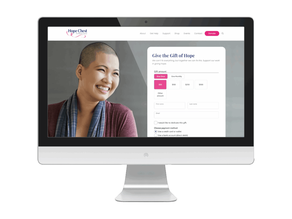
Hope Chest funds breast cancer support, and their legacy site wasn’t doing the mission justice: the story wasn’t clear, the calls to action were weak, and nothing guided visitors toward the next step. We redesigned it on WordPress, mobile-first, with strong calls to action and clearer storytelling, so a donor grasps the mission and how to help almost immediately. That mobile focus matters when so many supporters arrive from a phone.
FastTrackerMN
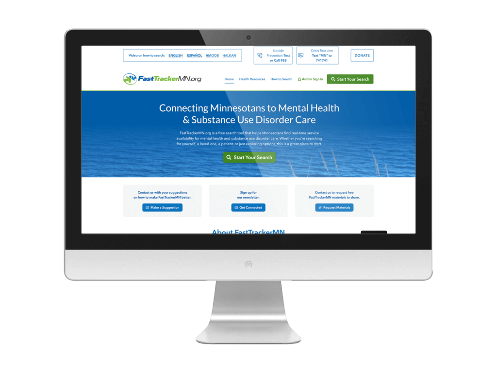
FastTrackerMN is a free tool that helps Minnesotans find mental health and substance use disorder care, with real-time information on what’s actually available. The old way meant outdated listings and dead-end searches, a painful place to land when you’re looking for help for yourself or someone you love. Because the entire purpose is connecting people to care quickly, at no cost and with no ads, accessibility and search clarity aren’t features layered on top. They are the product. It’s the clearest example in this post of a site where accessibility is simply whether the mission works.
If you or someone you know is in crisis, you can reach the 988 Suicide and Crisis Lifeline by calling or texting 988 in the U.S.
Frequently asked questions
Let’s talk
ArcStone builds accessible websites for health organizations that have to work for real people on hard days. If your site is hard to use, hard to update, or no longer reflects the people you serve, we’d welcome a conversation. The right next step depends on where you are, and we’ll tell you honestly what that is.