
Accessible Websites for Associations and Membership Organizations
Most association websites fail at the login
Here’s the moment that decides whether an association website is working. A member comes back to renew, register for the conference, or pull one document, signs in, and either glides straight to what they need or hits a wall: a second login, a broken registration form, a resource they can’t reach. That wall is the single most common complaint we hear about association sites, and it’s almost never a design problem. It’s an integration problem.
That’s the thing to understand about building for associations: the public website and the membership system are not two projects. They’re one. Get that right and almost everything else follows. Get it wrong and no amount of good design saves the member experience.
We’ve spent 29 years building for mission-driven organizations, and associations are some of the most common work we do. Here’s what actually matters when you build for them, and four associations that show it.
The integration is the product
Dues, renewals, event registration, member directories, protected content: for an association, all of it usually lives in an association management system (AMS), separate from the public website. When those two don’t talk to each other cleanly, members feel every seam. When they do, the seam disappears. A member signs in once and moves between public pages, members-only resources, and event registration without ever noticing where the website ends and the membership system begins.
That seamlessness is the actual product an association is buying, and it’s why our association work so often centers on AMO, the membership platform we build to live inside a WordPress site rather than bolted on beside it. Building accessible websites for associations starts here, because if you take one thing from this post: when you evaluate a web partner for your association, the question isn’t whether they can design a nice site. It’s whether they understand the membership system the site has to run on.
Three other things that separate good association sites from bad ones
Integration is the foundation, but three more jobs sit on top of it, and most association sites get at least one wrong.
Serving members and non-members at once. Prospective members need a persuasive front door and an obvious way to join. Current members need fast access to what they already pay for. One site, two audiences, and the easy failure is doing one well and the other badly.
Taming a content library that never stops growing. Associations accumulate resources, archives, and event materials for years. Unmanaged, that becomes hundreds of pages nobody can search. The value is real, but only if members can find it, which is a job for information architecture and search, not for adding more pages.
Accessibility, which is both legal exposure and a membership issue. Your members include people with disabilities, and an inaccessible portal or registration form locks them out of benefits they’ve paid for. WCAG 2.1 AA is the standard to build toward, and for association teams that are small and stretched, accessibility also has to be maintainable: build on a platform staff can actually run, with real training, or the site drifts out of date and out of compliance the moment it launches.

Four associations, four lessons
Each project below shaped the thinking above. Follow any link for the full story.
Florida Physical Therapy Association: when the integration is the whole job
FPTA is a professional association based in Tallahassee with nearly 7,000 members, and their problem was the classic one. They had outgrown the content management built into their old association software: inefficient, hard to manage, and wrapped around a content library so large members couldn’t navigate it. We rebuilt the site on WordPress with a custom AMO integration and a searchable resource library, so public and members-only content finally lived in one place members could actually move through. This is the integration-is-the-product idea in its purest form: the win wasn’t a prettier site, it was a website and a membership system working as one.

National Council on Independent Living: five sites became one
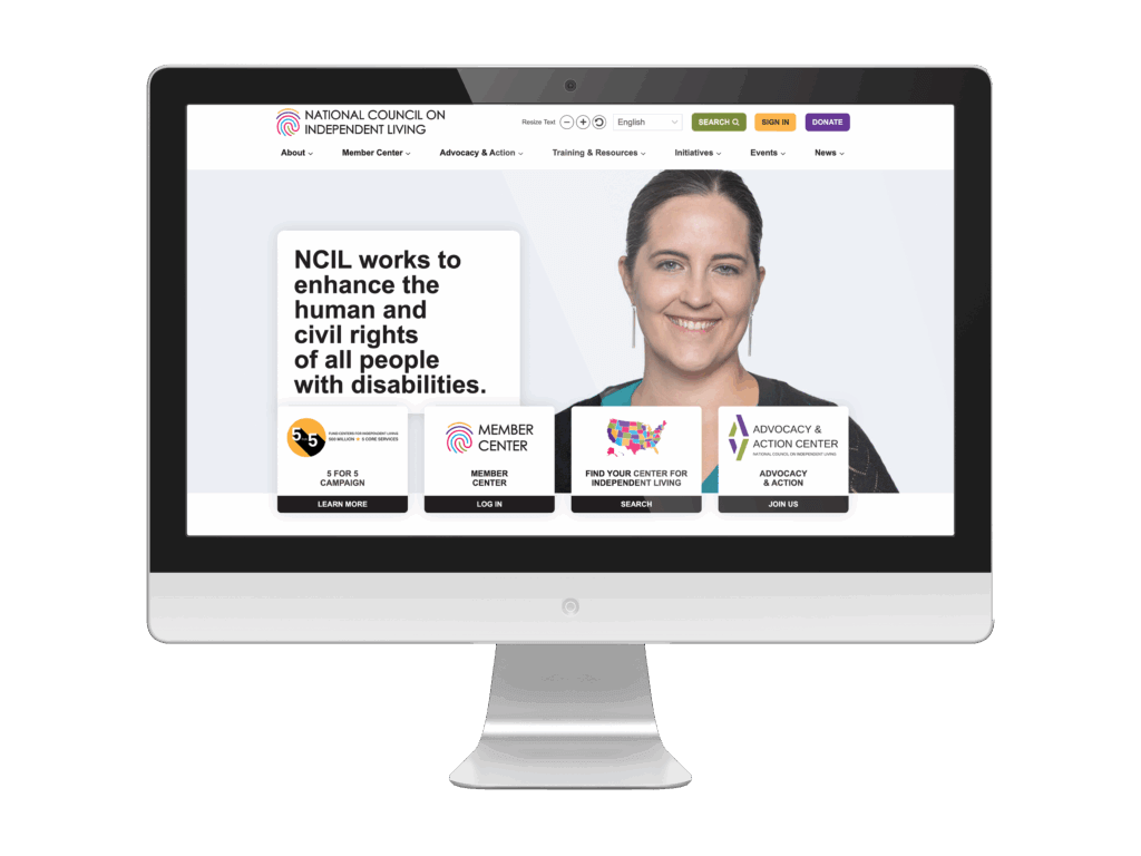
Sometimes the problem isn’t one bad site, it’s too many. NCIL, the longest-running national cross-disability grassroots organization, run by and for people with disabilities, had fragmented across five separate web properties, which confused members and diluted their advocacy. We consolidated all five into one cohesive hub on WordPress with the Kadence block editor, and because NCIL champions accessibility as its core mission, the bar was to preserve their already high standards while simplifying navigation for both individual advocates and member organizations. The lesson travels to any association: one strong, unified site beats a scatter of weak ones.
National Council for History Education: freeing the people who run the site
The audience an association site serves most often is its own staff, and theirs were stuck. NCHE, which serves history educators nationwide, ran on a closed content management system that made every update painful, on top of 225+ disorganized pages, weak search, and missing image alt text. We rebuilt on WordPress, accessible to WCAG 2.1 AA, with a revised sitemap, cleaner templates, and recorded training. The headline result wasn’t visible to members at all: editing became dramatically easier, and the staff finally controlled their own site instead of fighting it.

Association for Psychological Type International: modernizing the brand and the standard together
An association’s website is also its first impression, and APTI’s was working against them. Their legacy site and logo felt dated and didn’t connect with younger professionals, despite a mission built on nuance and growth. We led a rebrand and redesign, building a new WordPress site to WCAG 2.2 AA with a fresh logo, clearer structure, registration forms, and event-calendar integration. The takeaway: an association doesn’t have to choose between looking current and being accessible. APTI modernized its image and raised its accessibility standard in the same project.

Frequently asked questions
Let’s talk
ArcStone builds accessible websites for associations and membership organizations that have to serve members and staff at once. If your site is hard for members to navigate, hard for your team to update, or no longer reflects your organization, we’d welcome a conversation. The right next step depends on where you are, and we’ll tell you honestly what that is.