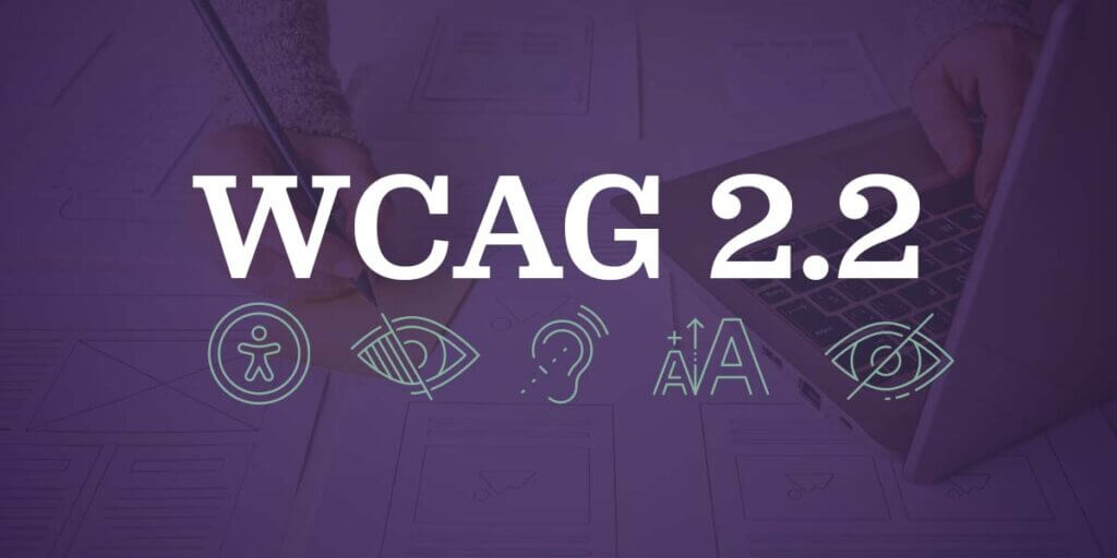
WCAG 2.2 Highlights and Success Criteria
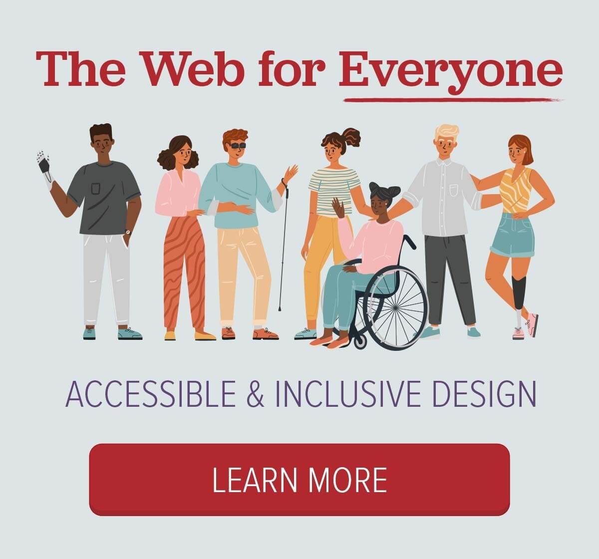
ArcStone believes in an inclusive “Web for Everyone,” so we’re committed to WCAG Level AA conformance. This means that we’re continuously updating our processes to include new requirements.
A few months ago, WCAG 2.2 rolled out new guidelines and success criteria to improve web accessibility for individuals with cognitive, mobility, vision, and hearing disabilities.
Here are the main points and new success criteria introduced in WCAG 2.2:
Focus Appearance
Enhanced guidelines for how items receive keyboard focus, ensuring they are at least partially visible (AA level) and fully visible in an enhanced version (AAA level), benefiting people who can’t use a mouse. Many people, including older people, can’t see small changes in visual appearance. The goal is to make it easier to spot the keyboard focus.
The term “Focus Appearance” in the context of WCAG 2.2 refers to the visual properties that help users identify which user interface component has the keyboard focus. Essentially, it’s about making it clear which element on a webpage is currently selected and can be interacted with, such as buttons, links, form inputs, etc., when navigating using a keyboard or other assistive technologies.
Dragging Movements
A dragging movement is when you tap or click on a starting point and need to move it to a new point. Many of us regularly encounter dragging movements when using Kanban boards like Trello, online maps, or attempting to reorder presentations. The new WCAG 2.2 success criteria require that dragging actions can also be completed using a single pointer without dragging, aiding those with mobility issues. The goal is to offer an easy-to-use alternative to dragging movements.
Target Size (Minimum)
Imagine you’re playing basketball and you have two hoops. One is the standard size, and the other is the ten times larger. Making a basket in the big hoop will be much easier. This same rule applies online. It can be challenging for some people to click on items when they’re too close together. The new Target Size (Minimum) criteria specify that targets for pointer inputs must meet a minimum size or have sufficient spacing around them, facilitating easier interaction for users with physical impairments. The goal is to ensure that clickable items have enough space around them to make it easy for people to click.
Consistent Help
When users can’t find the Help they need, they may make a mistake or leave your site feeling frustrated. Consistent Help stipulates that help channels such as email, phone numbers, FAQs, chatbots, and forms occur in the same relative order, assisting users with cognitive disabilities by making help features easy to find.
Redundant Entry
We’ve all encountered long, complicated, tedious, time-consuming forms. Redundant entry aims to reduce the need for users to enter the same information multiple times in the same session, helping those with cognitive and memory issues. Yay!
Accessible Authentication (Minimum)
The Internet can be a scary place, and we must do what we can to keep our information safe. Accessible Authentication (Minimum) ensures that steps in an authentication process do not require cognitive function tests, such as remembering a password, unless alternatives are provided. Users may authenticate themselves by entering the information they know such as their mom’s maiden name) or entering the data they’re given, such as a one-time code.
Focus Not Obscured (Minimum and Enhanced)
We’ve all been to sites using sticky content. Whether it’s a header, a banner, or a non-modal dialogue, this content may end up covering the components users need access to. Focus Not Obscured (Minimum and Enhanced) addresses the visibility of user interface components receiving keyboard focus to ensure they are not hidden by other content.
General Guidelines and Principles
WCAG 2.2 continues to emphasize the importance of clear and simple language, straightforward navigability, attention to color and contrasts, support for assistive technologies, provision of captions and transcripts, and error message clarity. It maintains using headings, labels, and alternative text for images to improve comprehension and navigation for users with disabilities.
Levels of Conformance
There are three conformance levels, meaning that you’ve met requirements from basic to most complex.
Level A: Basic accessibility features necessary for some users.
Level AA: Targets broader accessibility and is required by many governmental regulations.
Level AAA: The highest level, challenging to meet in full but represents the gold standard in accessibility.
WCAG 2.2 builds upon the foundation laid by previous versions, ensuring backward compatibility and focusing on inclusivity for users with diverse needs. By adhering to these guidelines, web designers and developers can create a web for everyone.