Data + storytelling: How your data can speak for itself.

A recent client project compelled me to update my skills and learn about current trends in Business Intelligence (better known as BI). BI is a broad term that mostly refers to using software systems to consume and display information in ways that are easy for us to understand—charts, graphs, dashboards, etc. This deep dive opened my eyes. There is A LOT happening in this space and it’s well worth the time to pop out of our bubbles and take a look.
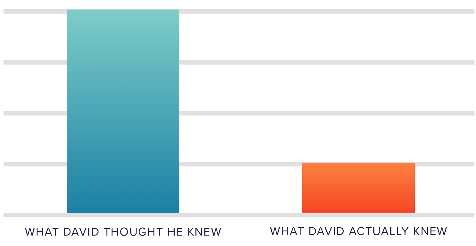
It ain’t what you don’t know that gets you into trouble. It’s what you know for sure that just ain’t so.
—Mark Twain
I thought I knew about data, charting and reporting. I was wrong.
Once I admitted this, I dove in. I sampled 15 different BI software platforms, read a ton of blog posts and studied the three highest-rated books on the subject.
Here are the most useful golden nuggets from my journey through dataland.
The best book I read is, Storytelling with Data, by ex-Googler Cole Nussbaumer Knaflic. It’s a quick read and should be required for anyone who needs to use a chart to explain anything.
The analogy she uses is not to make your audience “shuck oysters for pearls,” that’s your job. You need to shuck ‘em. You need to do the work of finding the pearls and make your points obvious. Don’t show a chart and then expect people to make sense of it. Call out your points—shuck those oysters!
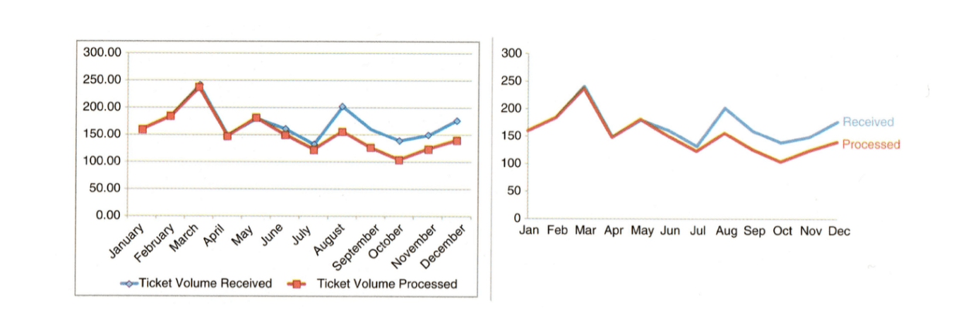
Here’s an example from her book:
Example one:

Example two:

In the second image you see the main point. It’s obvious. It’s easy to read, the experience of seeing the next chart is, “Ahh, the pearl is there.”
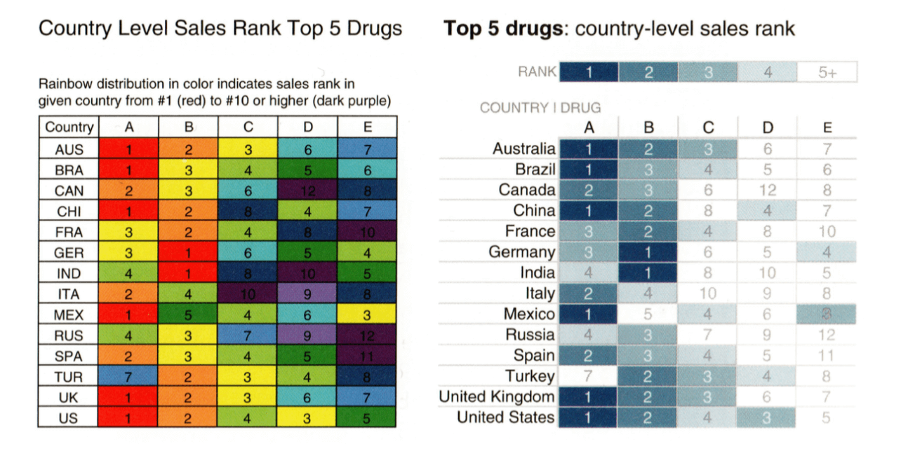
Other than the pearl shuckin’ example above, Knaflic offers many other examples and approaches for better communication. Two more that are compelling and easy to remember are to reduce clutter and use color sparingly.
The differences in the examples she provides are striking…
1. Reduce clutter
2. Spare Colors (one palette if possible)
Tools
Aside from the basic design approaches related to creating charts, the different BI tools that are used to deal with pearl shucking and chart creation can be overwhelming.
I’ve narrowed it down to the top three from my exploration: Tableau, Google Data Studio, and Domo.
1. Tableau is the darling of the data visualization world.
Of all the tools I tried, Tableau was the most intuitive and well designed. It can easily pull in data from just about any format and gives you powerful analytical and presentation tools. Tableau is the 2007 iPhone of data visualization platforms, the rest of the industry seems to be playing catch-up with them.
2. Google has a free tool called Google Data Studio.
While it’s not as rich as Tableau, Google has been making rapid improvements to the platform. For simple visualizations or dashboards related to Google data (like web traffic, etc.) it’s a compelling platform for analysis and exploration.
3. Last on my short list is Domo.
Domo is a different beast in that they’ve already connected to most of the significant software platforms on the Internet. They excel at providing dashboards and overviews from all the software you already use and pull it all into one place. Think of Domo as an easy to configure dashboard that combines data from online services like Quickbooks, Salesforce, and Mailchimp, etc. all in one place.
Key Takeways
- David didn’t know much. Now he knows just a tiny bit more, but still not much. 🙂
- Shuck those pearls – let people know what they should be looking at.
- Reduce clutter and use spare color schemes for more impact.
- There are hundreds of tools for charting and BI, check out Tableau, Google Data Studio, and Domo first.
Please feel free to reach out to me if you have questions or comments on Twitter @dcarnes.