Website Accessibility Hurdles – Balancing Accessibility and Design
Nicholas Longtin | July 2022
Many think that creating an accessible site means making concessions in design or branding. Despite the challenges of developing accessible sites, you can have your cake and eat it too. Keep reading to see how to incorporate a brand’s aesthetic into an accessible design.
Approaching Accessible Design
The first step in building an accessible website is understanding limitations when it comes to color, contrast, font and more. Although there are strict guidelines for some things, like text contrast ratios, many elements don’t have to meet accessibility standards. For this article, we will be referencing the WCGA 2 AA accessibility standards. This is the level of compliance we recommend for almost all organizations.
What Needs To Be Accessible?
- required for functionality, or
- NOT required for functionality.
Common Design Elements Exempt From Accessibility Include:
- Your logo
- Decorative icons
- Background elements used for decoration
- Abstract photos or design element not intended to be content
While some elements are exempt from accessibility standards, your website should still be as accessible as possible. If your brand uses icons that don’t have to be accessible, it’s still valuable for those with impaired vision to see them.
Common Design Elements That Must Be Accessibility Include:
- All navigational elements
- All buttons, links, and actionable elements
- All illustrations and photos important to the understanding of content
- All forms and individual form elements
- All section separators, headings and text content
Adapting Your Existing Branding
We recommend you bake accessibility into your brand guide and instruct designers on how to implement brand elements. If you have an older brand guide that doesn’t mention accessibility, you can adapt the brand elements.
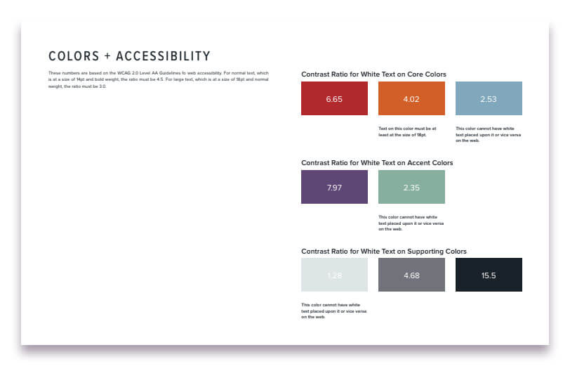 ArcStone’s own brand guide features a page on accessibility and colors.
design & color considerations
It’s unlikely that all your brand colors have enough contrast to be accessible in every situation. An often problematic use of brand colors is using brand-colored text over black or white. If your text and background color combination don’t meet the minimum ratio of 4.5:1 you’ll either need to increase the text size or change the color.
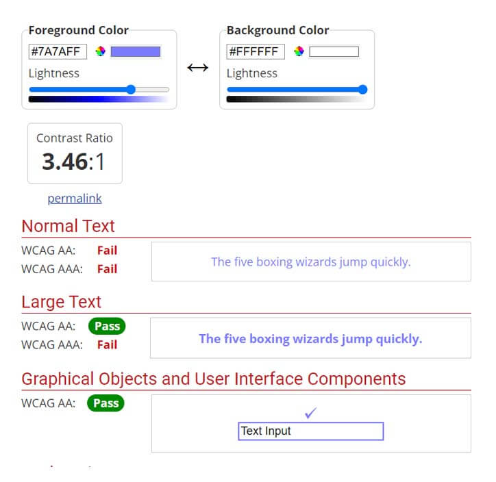 Use a tool like the WAVE contrast checking tool to ensure your designs meet minimum contrast requirements.
-
limit the number of unique colors used, and
-
never use color alone to indicate important information, such as navigation items.
Fonts, buttons & calls to action

How To Handle Common Design Accessibility Issues
Although accessibility can be complex, we often see the same issues over and over again. In this section I’m going to cover the most common issues we run across and how to avoid them.
Avoiding UX Accessibility Issues
How users interact with your website, or the “user experience (UX),” is critical. Even if all elements are accessible, it can all fall apart when it comes to users actually using the site.
Common UX Design Accessibility Issues To Avoid:
-
Don’t rely on hover states. Many users won’t be using a mouse or software that can distinguish between pointer states.
-
Don’t use color alone to determine the functionality of page elements
-
Don’t leave out white space and section indicators. A crammed design often has accessibility issues.
-
Make sure to label all form fields.
-
Make sure all clickable elements have coding in place to identify their functionality.